08/02/18
Splash screens typically serve to enhance the look and feeling of a game, it is the first thing the player sees when launching the game.
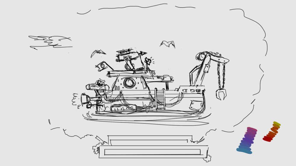
The fog, darkness and spotlight gives the player the aesthetic feeling of mystery before the game has started to make the player prepared and expected for what is coming next.
Process
While making the splash screen, we were sitting in the group together while drawing it so everyone could be involved in giving feedback. It is always good to sit with others who are not artist because they can give you another perspective.
To make the splash screen we wanted the player to be able to see the side of the boat, to give the feeling of the steam punk art style we chose, because it can be very hard to show via top down we thought it would be a good opportunity to go all out and make it look interesting so the player really feels like steering the boat from the splash screen while playing the actual game.
The purpose of the birds in the screen was to indicate that the boat is a fishing boat. The choosing of light in the window to show the contrast from the warmth inside compared to the cold and frightening outside. The searchlight indicates that something is down in the water and that you are going to use it afterwards in the game.
The light in the window was placed there so the player not only focus on the crane because of the high contrast it is shown there. To lead the eye to look at the whole ship.


100 % opacity 50 % opacity
Stylistic choice
Our game is based on the concept of Umibozu, we wanted to make it look different form the original art style so we choose steam punk to make it interesting.
There was a lot of problems with how the colors should look like. At first there was a lot of cobber colors to make it more mechanic, but it was hard to fit it with the more mysterious feeling. After a lot of fail and trial it was still some cobber in the boat but mainly very desaturated reds and tinted slightly with the blue/purple color from the water.
In the first picture it was more saturated but to make it feel like the boat was being in the fog the opacity got decreased.
/Linda S. Khamphoukeo
Lead Artist of Team Ouroboros

I think it looks great! Having the boat shown from the side in the ‘splash screen’ was a really good idea. That way the player will get familiar with the boat (which later serves as the avatar in the game – which the player is going to relate to while playing) so it is good that the player can connect to the boat even before the game starts. It also sets the mood in a very good way. It gives me a feeling of mystery and adventure, as well as feeling a bit uneasy of what might show up in the dark that surrounds the boat.
Having a nice start menu and splash screen is great, but make sure that the art in the game looks nice as well. It would be disappointing to see a super cool image in the beginning but the actual avatar boat in the game doesn’t look as polished at all.
You didn’t state in your post how many work hours that was put into making this pic, that might be interesting to know. Perhaps in the next post.
Looking forward seeing more of your art. Keep up the good work!
LikeLiked by 1 person
Thank you Natali for the feedback~~
LikeLike